It's a frustrating scenario: A customer has navigated your funnel, shown high intent, but abruptly abandons the journey right before submission.
This high customer churn at the "last mile" is a critical problem, but the good news is that the core strategy, product, and targeting are working. The leak likely lies in performance, UI/UX, or information gaps at the form validation stage.
By systematically addressing these friction points, you can significantly reduce customer churn and convert high-intent users into customers. This article provides an actionable framework and checklist to help you identify and eliminate common churn risks associated with forms.
We are focused on reducing churn here, not just optimizing conversion. The user has demonstrated intent; our task is to remove the final barriers.
Information gap: Checking what’s missing as a key to reduce churn risks
Users often abandon forms not because of an error, but because they lack crucial information or options necessary to complete the transaction or feel secure about it. Addressing these voids is a core strategy for reducing churn.
Common reasons for customer churn due to missing information:
- Payment & invoicing constraints: They don't see their preferred payment method (e.g., specific credit card, regional digital wallet).
- Business needs: They need an invoice right away but cannot find the option, or they require specific data fields on their invoice that are not available to fill out.
- Lack of confirmation: There is no clear order summary or review screen. Users fear hitting "submit" without a final check, and they are equally afraid that going back will reset the entire process.
- Unclear policies: The return policy, data policy, or delivery policy are not explicitly linked, visible, or clear, leading to doubts and loss of trust.
How to understand what users lack and reduce churn risk:
The combination of a high drop-off rate on the validation page and a high number of clicks on "back" or "help/FAQ" links near the form submission area are strong indicators of missing information. Analyzing your churn data this way helps pinpoint these gaps.
Complexity barrier: Minimizing fields and clutter and reducing churn
While missing options can cause abandonment, over-complication is an equally common source of customer churn. The goal is minimum effort for maximum data acquisition. This is a core pillar of reducing churn rate.
Reduce fields to fill:
The less data required, and the less typing involved, the better. Supporting the user with automatic suggestions (like address lookup) can work wonders in reducing churn.
Note on optimization: Sometimes, optimizations designed to speed up the process can backfire. For instance, poor map integrations for location lookup can frustrate users when they can't provide their exact address, leading to frustration and ultimately, customer churn. This is a factor in reducing customer churn that is often overlooked.
Reduce clutter (visual and cognitive overload):
Clutter is not always obvious. It’s anything that makes the form visually or cognitively overwhelming.
How clutter in your forms UI manifests itself:
- Fintech/Registration context: Too many legal disclaimers, permission toggles, or unnecessary "why we need this" tooltips packed onto one screen.
- Ecommerce checkout context: Overly complex promotional fields, multiple shipping options hidden behind non-intuitive menus, or excessive upsells and cross-sells displayed next to the critical submit button.
- Quick commerce/Utilities/customer support context: Dense blocks of text (e.g., T&Cs) or multiple unneeded options (e.g., choosing a specific delivery slot when "ASAP" is sufficient for most).
- General manifestation: Inconsistent design elements, too many colors, small fonts, or elements competing for attention (e.g., a "Save for later" button that is visually as prominent as the "Submit" button).
Interaction mechanics: Improving tappability and performance to reduce churn rate
Friction in the actual interaction with the form is a direct and often easily detectable cause of abandonment. Fixing these technical issues is key to churn reduction.
Improve tappability and touch targets:
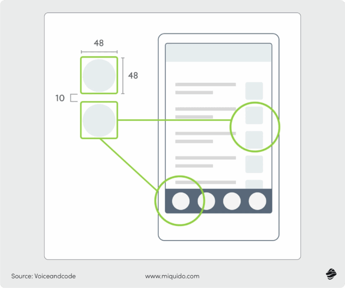
Tappability issues are often more detectable through technical analysis. Ensure your design adheres to platform guidelines, which is crucial for reducing churn:
- Apple iOS (HIG): Design touch targets with a minimum size of 44 points.
- Google Android (Material Design): Recommends 48 dp tap targets.
Even if buttons adhere to size guidelines, a cluttered UI can still affect successful tapping. It must be considered as a system.

Another potential indicator of tappability problems is a high number of "rage clicks" or micro-conversions (e.g., a high ratio of touch events to successful form field focus events) in a specific area, as visible in heatmap or session replay tools.
This means users are trying, but the element is not responding as expected, which significantly contributes to customer churn rate.
Trust and emotion: Rethinking permissions and error messages to reduce churn
The final layer of preventing churn deals with the emotional and psychological experience of the user. This is where subtle design choices can lead to a significant reduced churn rate.
Rethink your permissions and policies:
Your users may feel intimidated with the permissions they have to grant. Or, it may feel that your policies are not explicit enough and left with doubts that make them abandon the form whatsoever. This is a common factor when examining why users become churned customers.
How to reduce churn linked to policies and permissions:
- Text and placing: Use plain, jargon-free language. Instead of presenting a dense legal document, provide a short summary with an easily accessible link to the full document. Place policy links immediately adjacent to the relevant submission or permission button.
- Hiding vs. visible: Use progressive disclosure. Hide advanced or less-common options (e.g., "I wish to opt-out of all communications") behind a clear toggle or link, but keep mandatory consent clearly visible.
- Color and contrast: Ensure policy links and disclaimers have high contrast with the background but are not the same color as the main CTA button (e.g., use a light gray or blue link text, not the brand's primary action color). This strategy helps prevent customer churn related to anxiety.
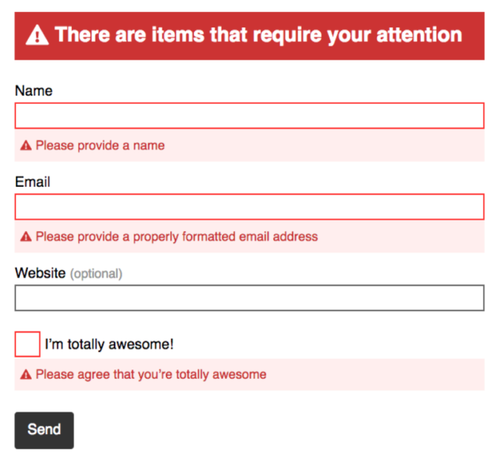
Rethink your error message colors:
We instinctively use the "traffic light" logic: incorrect = red, correct = green. But we forget that the psychological impact of colors can be intense.
For instance, red triggers a strong emotional response. Customers may assume their card is compromised or they've done something wrong. They abandon rather than retry.
Using softer, non-aggressive colors for simple validation errors can transform a stressful experience into a guided one, significantly helping to reduce customer churn rate.

The ultimate churn reduction checklist for form validation
This framework is designed to help your team analyze churn data and systematically fix conversion leaks. This effort in reducing churn is vital for long-term growth.
| Category | Actionable checkpoint | Rationale & keywords |
| Information gap (The "missing") | Is the Order/Summary visible and editable before the final submit? | Prevents fear of proceeding/resetting. |
| Are all common/regional Payment options clearly displayed? | Addresses business-critical lack of payment flexibility, helping reduce churn. | |
| Are policies (Return, Privacy, Shipping) linked and summarized near the submit button? | Builds trust and eliminates policy-related churn risk. | |
| Complexity barrier (The "too much") | Can the total number of required fields be reduced by 10%? | Focuses on reducing churn by decreasing user effort. |
| Is auto-fill/auto-suggest (address, city, state) utilized wherever possible? | Increases speed and prevents churn from data entry errors. | |
| Are legal/permission toggles collapsed or using progressive disclosure? | Minimizes visual clutter and cognitive overload, lowering the risk of churn. | |
| Interaction mechanics (The "friction") | Do all tap targets meet the 48dp (or 44pt) minimum size? | Addresses basic usability and preventing customer churn from misclicks. |
| Have heatmap analysis and session replays been checked for "rage clicks" or repeated field interaction? | Pinpoints specific, high-friction areas causing customer churn rate spikes. | |
| Trust & emotion (The "doubt") | Are error messages displayed in helpful, non-aggressive colors for simple input errors? | Reduces panic/stress and encourages users to retry (effective churn prevention). |
| Is the tone of the form text and error messages helpful, not accusatory? | Maintains positive user experience, fostering reduced churn. | |
| Are only strictly necessary permissions asked for at this stage? | Avoids intimidating users who become churn customers due to privacy fears. |
The ultimate recipe to prevent churn does not exist, but this checklist should help you eliminate the most common issues that mess with customer churn statistics. If you are wondering how to reduce churn rate, a support of experienced UX and UI designers may be invaluable. We happen to have some on board - let’s talk!

![[header] how to reduce churn on a form validation stage (1)](https://www.miquido.com/wp-content/uploads/2025/12/header-how-to-reduce-churn-on-a-form-validation-stage_-1-1920x1280.jpg)

![[header] healthcare trends 2026 – a patient centric future](https://www.miquido.com/wp-content/uploads/2023/12/header-healthcare-trends-2026-–-a-patient-centric-future-432x288.jpg)

![[header] top 5 use cases for autonomous delivery in foodtech today](https://www.miquido.com/wp-content/uploads/2025/08/header-top-5-use-cases-for-autonomous-delivery-in-foodtech-today-432x288.jpg)
