Real-time fleet management app redesign
Augmenting UI, UX & app features for better usability


Introduction
About project
Modernizing an app is a challenge that requires careful planning. Designers and developers walk a fine line - on one hand, striving to introduce innovation, and on the other, needing to respect users' existing habits.
In a project we carried out for Quartix, our team also had to find the right balance. The company specializes in providing fleet monitoring systems relying on GPS technology. Their app enables tracking the vehicles in real time on a map. On top of that, Quartix tracks the driving style of every driver in the fleet, enabling companies to optimise operating costs and enhance safety.
The app, already with a strong user base, needed a redesign that would improve navigation and make it easier to extract key fleet insights. Smooth tracking of multiple map markers without performance issues, clear charts, and an intuitive system that still feels familiar - our goal was to make the app as fast and reliable as top-tier logistics services.
Check how we resolved the key challenges in the modernization process and made the app run smooth like the fleet it tracks.
Industry
Logistics
Project type
Mobile
Duration
4 months
Tech stack
Cross-platform
Flutter


Project Challenges
Problematic app navigation
The app used unconventional navigation patterns between screens and sections. Combined with a lack of clear information hierarchy and unpredictable interface behavior, this made the experience potentially confusing and frustrating for new users.
An added challenge was that long-time users had grown accustomed to the existing - albeit illogical -flow. When designing the new navigation, we needed to strike a balance: build a more intuitive system that would still feel familiar enough for existing users to adapt quickly and with minimal frustration.
Unclear data presentation
Charts and data in the app were overly condensed, making them difficult to read and analyze. Users often struggled to interpret key information effectively.
Outdated and unappealing design
The app’s interface was visually outdated and lacked consistency. The available vehicle models were pulled from various graphic libraries, which disrupted visual harmony and diminished the app’s professional appearance.
Ensuring high performance with custom features
The app’s Live Tracking feature relied on custom markers in Google Maps with interactive tooltips, which could strain performance. Our team had to ensure the app remained fast and responsive - no matter how many markers were displayed on the map.


Solutions
Rebuilding navigation mechanics and logic
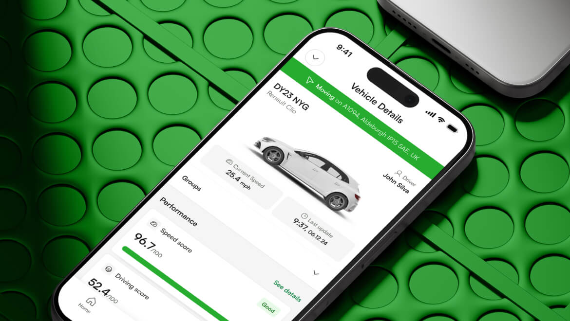
After identifying the unintuitive and inconsistent elements of the previous navigation flow, our team designed a new navigation architecture centered around the app’s core feature: the vehicle fleet map. The updated flow allows users to access vehicle data - charts, drive scores, and route history - directly from the map view, eliminating the need to switch between separate tabs.
Optimising data presentation, charts, and custom markers
We redesigned how data is presented, with a focus on making charts clear, intuitive, and interactive. Attention was given to bar width, proportions, contrast, and labeling to ensure information is easy to interpret and actionable. By streamlining assets and implementing additional performance improvements, we ensured that custom markers remain responsive and easy to track, even when densely populated on the map.
New interface design and unified vehicle models
As part of the redesign, we developed a modern, professional, and user-friendly interface that enhances both visual appeal and user experience. We also introduced a unified library of vehicle models - visually consistent and aligned with the app’s overall design language. This consistency across all graphic elements strengthens the app’s visual identity and reinforces a cohesive product experience.


Results
A more consistent and predictable Interface
New users can navigate the app more easily thanks to a logically structured layout, contextual access to key data, and improved WCAG.
Clearer data presentation
With the redesigned charts, users can analyze results more quickly and effortlessly, supporting more effective fleet management.
Modernized, professional look
The new design improved users’ first impressions. Implementing a unified library of vehicle models eliminated visual clutter and enhanced overall interface clarity, lowering user churn.
Available for projects
Want to talk about your project?
Partner with us for a digital journey that transforms your business ideas into successful, cutting-edge solutions.