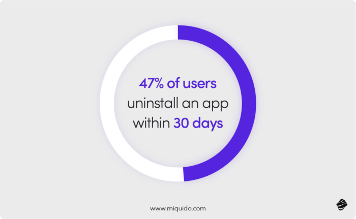
Did you know that 47% of users uninstall an app within 30 days? Most often...within the first 24 hours. The reasons vary, from being too heavy for their phone to lack of trust in data practices. Users look for different elements in apps, depending on their age group and region. For example, Germans want efficiency, while Polish users want a sense of security and intuitiveness.
However, one thing unites them all: everyone cares about an intuitive interface. This is precisely why mobile UX design is important for app retention and success. When UI elements are poorly positioned or confusing, users quickly abandon the platform.
Most apps fail not because of poor functionality, but because they create friction in the mobile experience. Users expect seamless navigation and instant understanding of how to achieve their goals, making thoughtful interface design crucial for preventing those devastating first-day uninstalls.
In most cases, a good interface is one that doesn't draw attention to itself – because it doesn't interfere with fulfilling the objective that brought users to the app. But what does this mean in practice?
Why do users abandon apps so quickly in 2025?
We asked Dominika, Market Researcher at Miquido, to share her thoughts. Here's what she claims:
After analyzing many mobile applications, I conclude that it’s not just about interface or functionality. The problem runs deeper: most uninstalls happen within the first day because apps fail to deliver immediate value and fall short of expectations.
The AppsFlyer report shows that in some developing markets, uninstall rates exceed 65%. This means an app has only a few hours to prove its worth before it ends up in the trash. Onboarding is the critical moment-if the app doesn’t give a clear reason to stay, the user leaves without hesitation.
Transparent app store pages (e.g., with video onboarding instead of empty screenshots), instantly showcasing the core feature instead of forcing a long tutorial, or push notifications tied to real user context rather than annoying reminders like “Hey, you haven’t visited us in a while”- this is where the competitive edge lies. Not in yet another “revolutionary” feature, but in the consistency of the experience from the very first interaction with the brand.
Companies still prefer to pour budgets into campaigns rather than onboarding, yet it is that first contact with the app that decides its survival.
Dominika Będkowska, Market Researcher at Miqudo
Onboarding that makes you stay: UX best practices
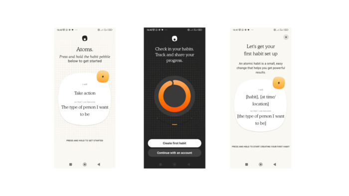
Our researcher points out the importance of onboarding; Bogusław Podhalicz, Design Lead at Miquido, also finds this aspect crucial for your mobile commerce app's retention. The onboarding optimization tips he shared with us apply to any niche, as they focus on the shift in user habits driven by the prevalence of mobile experiences.
Request only the essential information
Nothing irritates users more than having to fill out numerous forms. It can also raise doubts about the legitimacy of your app. Who knows how you'll use this data? Therefore, ask only for the information necessary for proper setup and personalization of the app, nothing more.
If you can skip a step, do it
The fewer steps to complete, the better. Mobile users have less time and are more distracted than desktop users. Combined with a shrinking attention span, this is an explosive mix—definitely unfavorable for your user acquisition rate. If you can easily combine a step with another, you probably don't need to keep them separate In this case, less is more.
The golden ratio? The answer, as usually, is: it depends. You need to find a balance between providing the essential information and making the process as simple as possible. However, looking at the apps that users appreciate for their UX, onboarding rarely has more than 4 steps.

Inform users about their onboarding progress
A simple progress bar or the number of remaining steps is enough. Not knowing what stage they are at can lead users to abandon the process. If they do, there's a good chance they'll never return.
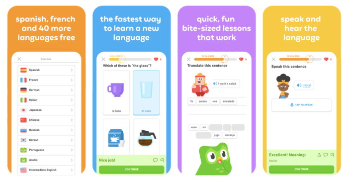
Duolingo is well recognized for its engaging onboarding strategy, featuring an owl mascot guiding users through the process. This includes personalized questions to tailor the experience and a progress bar that keeps users motivated to continue.
Cut the way to “Aha” moments
Users should quickly realize the unique value of the app. Design onboarding steps to give rather than take immediately. In other words, instead of burdening users with data entry at the very beginning, show them right away why it’s worth their time. Use pop-ups and animations, sneak the value proposition in the first steps so that users feel they are not wasting their time from the first second.
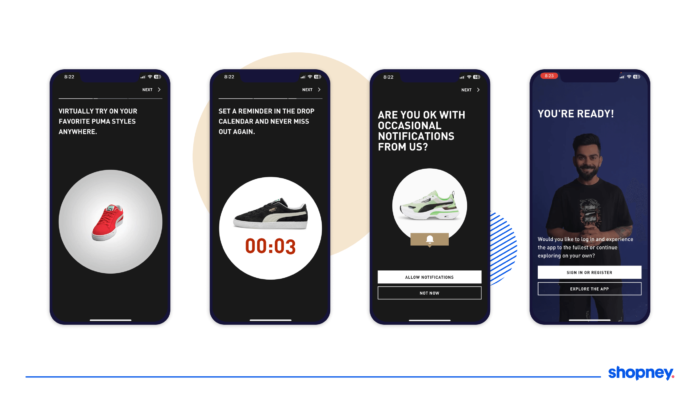
Onboarding in mobile commerce applications is crucial not only in the context of user adoption but also for retention in the long run. This is because a well-designed process sets the course for a positive user experience right from the start. This is especially important for applications with an extensive catalog that the user needs to navigate.
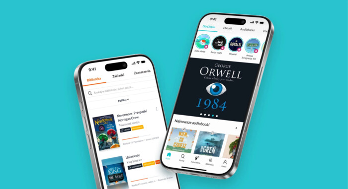
This was the case, for example, with Empik GO, which we helped create. The onboarding had to be designed in such a way as to provide the most "substantial" input for the recommendation algorithms, while at the same time not taking ages.
With all this, Empik had to keep in mind that a mobile app user might know exactly what they are looking for and be aware of their preferences—in this case, favorite authors or books—but they don't have to. When designing the user path, mobile UX designers had to find a happy medium and ask questions that would guide the algorithms toward the preferences of both seasoned readers and newbies who are just trying to motivate themselves to read.
When balancing between mobile and desktop versions of the website, companies often fail to avoid basic issues (incorrect keyboard layout, tappable elements too close to each other or too small). A significant advantage of a mobile app is the ability to design navigation and the interface entirely for mobile users. What should you pay attention to when designing navigation and design in mobile commerce? Here’s your detailed checklist.
Prioritize actions
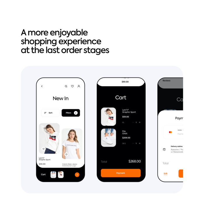
The golden rule among UX design principles: if you want users to perform a specific action, guide them to it. Once you define the primary actions in your app, make them easily accessible. Use prominent buttons, colors, fonts, animations, and UX writing to make these actions stand out. Place the buttons in strategic locations—between each few scrolls, in the middle of the interface.
Visual hierarchy is a powerful tool in guiding the user through the app toward a purchase. Use it to emphasize key actions and content. Larger buttons, bold text, and gradient shading—all these elements help the user understand where to look and what to click.
Reduce the complexity
Another UX best practice? Use the spotlight pattern to highlight crucial elements of the interface and reduce visual overwhelm. But also reduce, reduce, and again, reduce. Keeping the interface tidy will help users focus on the crucial actions. To avoid clutter, you could hide less frequently used options in secondary menus, which we will discuss in the further part of the article.
However, remember to keep the hierarchy as flat as possible. One too many menu levels can negatively impact the mobile user experience. Instead of dividing, try to group and reduce redundant menu elements.

Provide visual feedback
Through the appropriate use of highlights, transitions, and animations, you can help users navigate the app. Clearly indicate the active or selected state of navigation elements (e.g., highlighting the current tab) to help them understand where they are. Use subtle animations to transition smoothly between screens. All these aspects contribute to a better user experience.

Help users find the right products with automatic suggestions
Speed is the currency of m-commerce. To minimize friction and shorten the user's path to the desired product, it is crucial to equip the search bar with intelligent mechanisms. What's the solution? Implementing automatic suggestions (autocomplete) and hints.
The user should not have to type the full product name. After just a few characters, the system should display a list of potential results, popular phrases, and target sections. This reduces errors, saves valuable mobile user time, and is a direct relief for those operating one-handedly or in a rush.
The product page must support the consultation phase. Purchases, especially expensive or complex ones, are often discussed with family or friends. Introducing easy product sharing via a visible, yet non-dominant button on the product screen is an essential UX facilitation.
This button should launch the native mobile share sheet interface, allowing a link to be instantly sent via text message, social media, or messenger. This keeps the user within the app, removes the need to copy links, and allows them to quickly return to the purchase process once they have received approval.
Mobile UI and UX design built for everyone: key UI and UX principles of accessibility
When an app gets abandoned within just a day, it usually means most of its features weren’t even tested. Either it doesn’t have what we’re looking for, or…it’s simply disappointing to use.
Of course, everyone has their own habits. But there are design flaws so frustrating they’re impossible to ignore. And when we know there are plenty of alternatives – more intuitive, less cluttered – we don’t try to adapt. We just head back to the app store.
Things get even more critical when the app is part of a broader offer, like customer support. In that case, frustration doesn’t just end with a bad review – it often means full churn. From a business operations perspective, that’s not just losing a user; it’s a direct hit on long-term business growth.
“Built for everyone means built for no one”? In mobile commerce, that doesn’t really hold up. Most products need to appeal to a wide range of users, across demographics and aesthetic preferences. Even if your target is narrow, once you plan international expansion, you’ll have to account for health, tech, and environmental constraints. Mobile app UI and UX should reflect that.
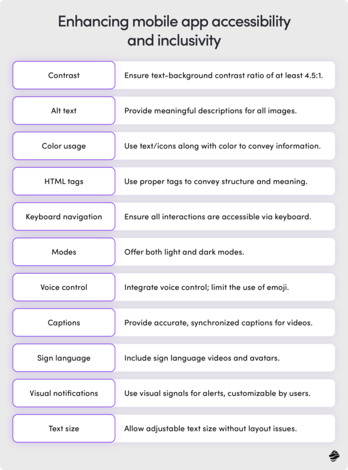
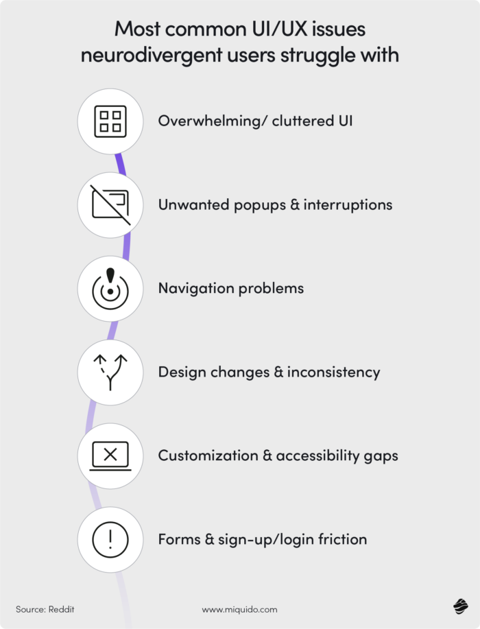
Accessibility is key here. Where to begin? When designing mobile apps, feedback from neurodivergent users often provides valuable insights for optimization of mobile UI design and mobile UX patterns. This group tends to be more sensitive to clutter, disruptive animations, or confusing navigation.
Yet solutions designed with them in mind – simplicity, consistency, clear flows – work just as well for neurotypical users. And in 2025, when people are overstimulated and flooded with tech, this approach is more than just inclusive – it’s a top digital transformation move.
40% of users abandon apps that take more than three seconds to load...but 70% of app abandonment stems from poor usability. This checklist is your chance to prevent churn by making the app intuitive and usable for any user, regardless of their challenges.
Inclusive UI and UX mobile design checklist
Cultural & linguistic factors
- Provide multi-language support and allow users to switch easily.
- Avoid idioms, slang, or metaphors that don’t translate well.
- Validate icons and symbols for cultural neutrality (test in target markets).
- Support both left-to-right (LTR) and right-to-left (RTL) text directions.
- Use localized units and formats for dates, times, currencies, and measurements.
- Include a way for users to manually adjust region settings, not just auto-detection.
Motor difficulties
- Ensure all features are keyboard-accessible and navigable without a mouse.
- Provide voice input support where possible.
- Use large, well-spaced tap/click targets to reduce precision needs.
Cognitive accessibility & neurodivergence
- Simplify layouts by reducing visual clutter; avoid overwhelming users with too many buttons, banners, or product suggestions.
- Minimize interruptions: avoid aggressive popups for ratings, notifications, or upgrades.
- Ensure navigation is predictable with clear back buttons and straightforward category structures.
- Maintain consistency: keep cart, search, and checkout buttons in fixed, familiar positions.
- Offer customization options such as dark mode, adjustable fonts, and simplified layouts.
- Reduce sign-up friction by providing guest checkout and quick login options.
- Manage notifications carefully: allow opt-in categories (sales, shipping updates, recommendations) and avoid irrelevant spam.
- Protect user progress: preserve cart items, form data, and shipping details even if the session refreshes or app restarts.
- Include "reduced motion" feature that tones down the animated elements within the app.
General accessibility
- Keep layouts clean and uncluttered to reduce cognitive load.
- Use plain, simple language; avoid jargon.
- Provide alternatives to time-limited tasks (extend, pause, or disable timers).
- Avoid excessive animation and allow users to turn off motion.
Sensory sensitivities
- Meet or exceed WCAG contrast ratio requirements.
- Support screen readers with semantic HTML/ARIA labels.
- Do not rely on color alone to convey meaning (add text, patterns, or icons)
- Provide captions and transcripts for audio and video.
- Ensure alerts have visual cues, not only sounds.
- Ensure sufficient spacing between buttons and controls.
- Offer alternatives to gestures such as swiping or dragging.
- Offer dark and light modes.
- Avoid flashing, blinking, or strobing visuals.
Technical & environmental limitations
- Optimize for low bandwidth (compress images, lazy load, minimize scripts).
- Design for low- and mid-range devices, not only the latest models.
- Ensure UI works with multiple input methods (stylus, touchscreen, voice, keyboard, switch devices).
- Test for outdoor readability (good contrast in bright light).
- Ensure essential actions can be performed one-handed.
- Provide offline-friendly fallbacks where possible (cached content, retry options).
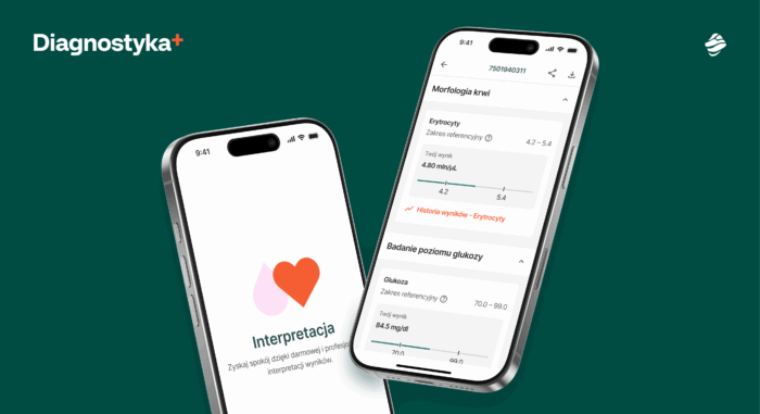
Miquido ensured these aspects were taken care of when developing a project for one of the biggest Polish labs, Diagnostyka. We made the app accessible and multilingual from day one. It supports screen readers for visually impaired users and is available in Polish, English, and Ukrainian.
The reputation of hamburger menus, especially a decade ago when we weren't as accustomed to mobile apps, wasn't particularly stellar. But today, we need to view them somewhat differently, through the lens that users have strongly – albeit painfully – adapted to them.
The truth is that, as design patterns, they bring numerous benefits, especially in mobile commerce, where user attention should be directed toward products or services. They simplify the interface, remove distractions, make space for what's crucial, and allow directing user attention toward conversion.
Recent research from NN-g confirms: users can recognize hamburger icons as menus, especially when:
- Positioned in the top-left corner
- Styled in the traditional 3-line format
Today, the question isn't so much whether to use hamburger menus, but rather how to utilize them effectively to avoid confusing and frustrating users. The most common pitfalls include being mistaken for other icons with similar formats, particularly when these appear in the left zone of the mobile screen, which is associated with navigation.
In mobile-first design, hamburger menus maximize screen space while maintaining minimalist design principles. Unlike desktop interfaces with horizontal navigation, mobile screens benefit from these menus over alternatives like tab bars or split screens that can overwhelm users. Proper button styles should clearly communicate the menu's function while complementing clean aesthetics.
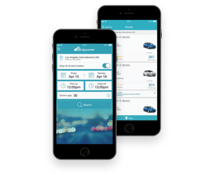
Keeping these pitfalls in mind, you can confidently leverage the benefits that such menus offer while protecting customers from non-intuitive pathways. When implemented correctly, hamburger menus serve as powerful tools for streamlined mobile user experience design and improved conversion rates.
Tappable touch targets for any mobile user: Foundational UX best practice
Untappable icons may not be the primary reason why users abandon apps, but over time they can create frustration and resentment. Nielsen Norman Group’s usability study from 2019 stated that tap targets should be at least 1 cm x 1 cm to minimize mis-taps, and since that time, it has become a standard - but still, there are many apps in app store that do not follow the recommendations.
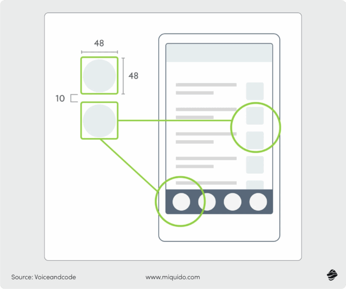
Since we’re already on the subject of interface accessibility, it’s worth digging deeper. Following touch target recommendations is not only the best protection against churn, it’s also a requirement for publishing apps in the App Store for iOS development or during cross-platform development. This is one of the real world examples that shows why mobile ux design is important – it directly influences both usability and compliance.
Apple’s Human Interface Guidelines (HIG) specify that developers should design touch targets with a minimum size of 44 points to ensure users can easily and accurately tap interactive elements in their apps. This standard is rooted in finger and hand ergonomics, and adhering to it is expected of developers.
On the Play Store side, the rules are slightly different: Google’s Material Design recommends 48 dp tap targets for accessible and reliable user actions across device densities.
In practice, keeping these standards in mind helps create smoother user flows and ensures your target audience can interact comfortably with your app – whether they’re using small screens or larger devices.
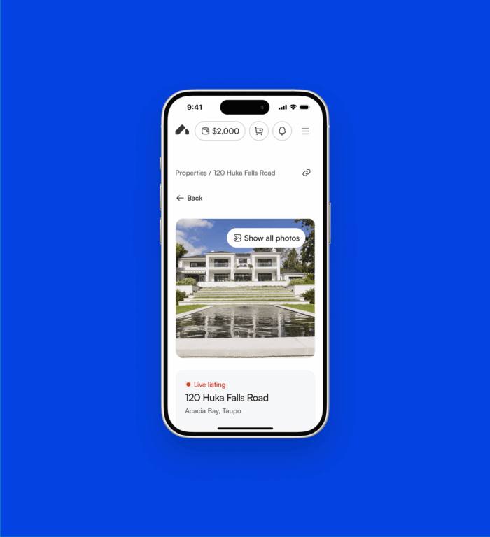
Miquido's mobile app for Homeshare is a good example of tappable design - each element has optimized size to facilitate drawing insights and navigating the app.
Finding the golden balance between clear product presentation and intuitive catalog navigation isn’t easy. But it’s critical: 85% of users expect intuitive navigation, with complex interfaces causing a 30% drop in engagement – and the product stage is exactly where most apps “trip up.”
Looking at different mobile apps in commerce, it’s clear that brands take very different approaches to navigation. A common pattern is having product images dominate the screen, but the way users move between them varies.
Take Zalando vs. Zara. In Zalando’s mobile app design, users swipe sideways to scroll through product photos, while scrolling down reveals product details and the cart. Zara does the opposite: scrolling down expands product photos, while horizontal scrolling moves to the next product.


At first glance, this difference feels small. But for older mobile users, who are used to a more standard formula, it can be confusing – and may even break the path to purchase. That’s why it’s smart to run focus groups before finalizing navigation, to understand the logic users naturally follow.
So what helps or hurts conversion? The answer, of course, is “it depends.” Still, it’s worth paying close attention to:
- the size of icons and fields where users define product characteristics, for example shoe size selector or clothing fit options
- the clarity of filters and sorting tools – especially when multiple attributes overlap
- the visibility of the “add to cart” button and how easily it can be accessed on smaller screens
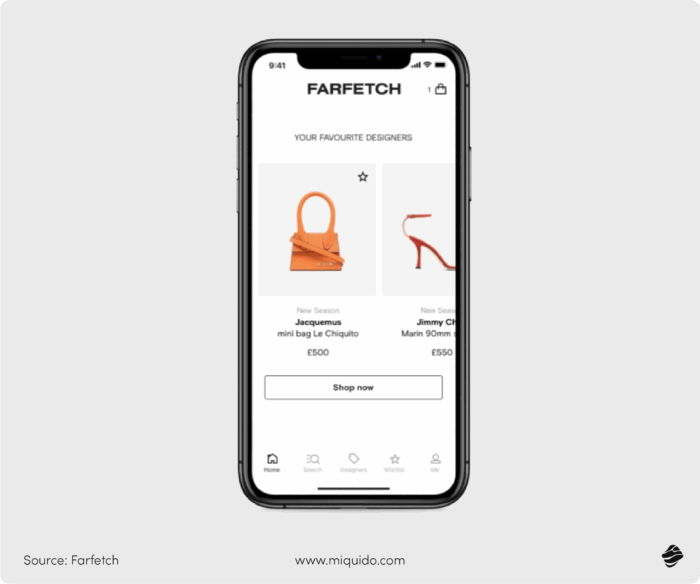
Ultimately, great mobile app ux is about allowing users to find and act quickly, with navigation that feels natural across mobile devices. When businesses invest in thoughtful mobile app design, they don’t just improve the mobile user experience. They directly impact conversion, loyalty, and long-term growth.
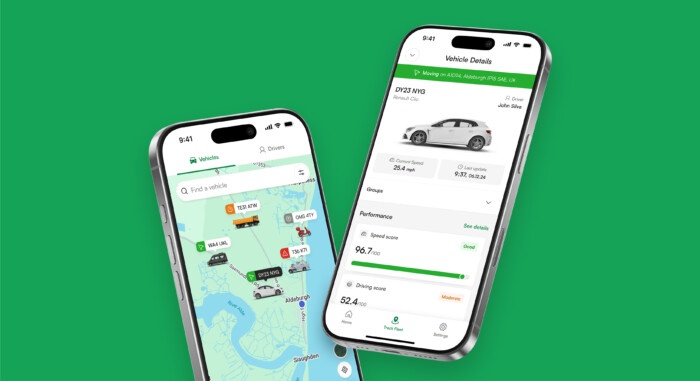
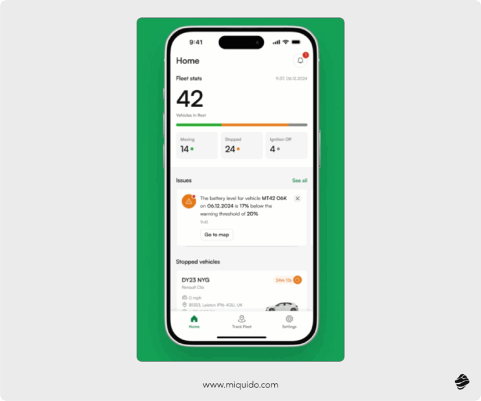
It may turn out that you should entirely re-center the navigation flow. That was the main lesson from our redesign of Quartix app, where our team designed a new navigation architecture centered around the app’s core feature: the vehicle fleet map. The updated flow allows users to access vehicle data directly from the map view, eliminating the need to switch between separate tabs.
Product configurators adjusted to mobile screens: Designing mobile apps that sell
Since we’re already talking about product presentation in mobile apps, we can’t skip smart product configurators. They’re becoming more and more common in B2C, and absolutely essential in modern B2B, shortening the path to pricing and purchase, while reducing errors and returns. But bringing them to life on mobile platforms isn’t simple.
First, the limited screen size of mobile phones forces every interaction to be optimized. Second, different mobile interfaces require careful adaptation so the configurator remains smooth and consistent across devices.
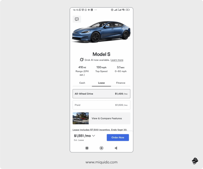
Designing a 3D configurator that works well on mobile can be especially tricky. The user interface needs to allow precise rotations, zoom, and adjustments, but on a small screen gestures often overlap or feel clumsy – leading to frustration instead of engagement.
The alternative? Smart product configurators powered by generative AI assistants. A conversational approach simplifies the process by cutting down on manual steps and guiding the customer directly to checkout, which maximizes conversion potential.
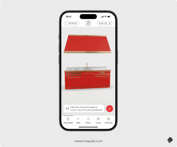
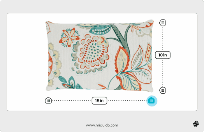
Parametric models are another smart way to streamline configuration for the user interface on mobile. Instead of switching back and forth between static versions of a product, parametric models let users adjust dimensions dynamically. This means customers can intuitively grasp scale and proportions without endless trial-and-error, making the process faster and clearer on mobile phones.
Interactive UI elements: Mobile user experience that strengthens value proposition
What’s one of the most vital UX principles in e-commerce? A sales-driving interface is often invisible. It doesn't get in the way; it just works.
But what if you do want the user to notice the interface? It must have a powerful, value-driven reason to earn that attention. This is where subtle, in-place interactivity becomes a superstar strategy, especially if your e-commerce app serves a specific niche. The goal isn't to force the user into a separate, heavy "configurator", but to enhance the current view.
Show product value right away with interactive elements in product catalog
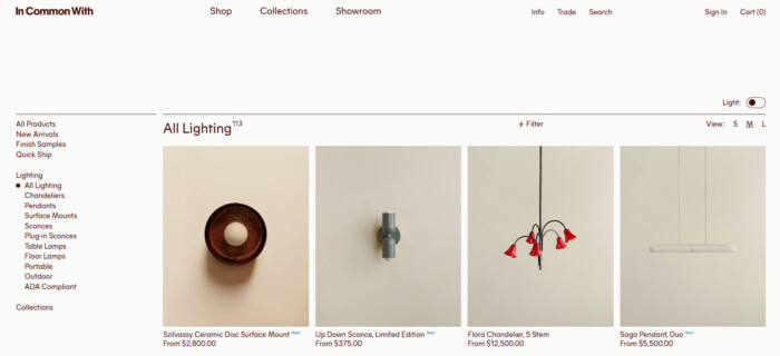
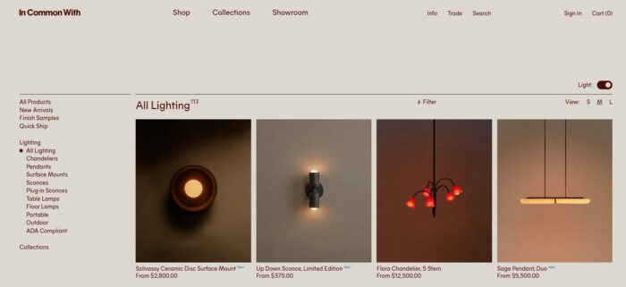
Think of that simple toggle in a lighting store that instantly shows you a lamp switched ‘on’ versus ‘off’ in its environment. Or consider a makeup store that lets you filter cosmetic swatches on the main photo to instantly preview them against your own skin tone.
This strategy excels at solving common buyer questions. Instead of a static, confusing photo of a TV’s back panel, a truly helpful interface provides an interactive diagram. As you hover over each port, a small tooltip instantly reveals its purpose and use. Or, imagine a store selling backpacks: rather than just listing dimensions, you click a "What Fits?" icon, and silhouettes of a laptop and water bottle instantly overlay the main photo, ending all guesswork about its real-world scale.
Banners are fundamental elements of the visual hierarchy, intended to immediately draw attention to the most important offer or novelty. To avoid "banner blindness" and make them valuable, they must be made interactive.
This means using subtle animations, dynamic countdown timers to the end of a promotion (reinforcing FOMO), or personalized messages. Such a banner is a dynamic, interface signpost that immediately directs the user to the section with the highest conversion value. However, they must be used sparingly so as not to compete with key CTA buttons.
Frictionless mobile checkout and payment: UX design principles that lead to conversion
Payment is the most vulnerable step in the purchase journey, especially in B2C. According to Forrester, 23% of online shoppers in the U.S. abandoned checkout simply because they couldn’t use their preferred payment method.
At this stage, friction doesn’t just lead to cart abandonment – it often results in churn and users switching to another app. And it’s easy to understand why: after spending valuable time selecting products, choosing configurations, and preparing an order, the customer feels deeply frustrated when they can’t actually finalize the purchase.
The issues here are not always about mobile UX design but rather about payment integrations and technical barriers. Still, a poor interface can make the situation worse, especially on mobile. Slow redirects to external banking pages, expired sessions, or broken flows across touchscreen devices all impact user experiences and cut into user engagement.
In B2B, different challenges emerge. Clients expect invoice-based payments, stored billing information, PO numbers, and ERP integrations. Without these, even a smooth app can turn into a headache. Here, good mobile UX is not just about visuals but about the flexibility to support business processes.
That’s why mobile UX design is important at the checkout stage – not only to remove friction but also to guide users through complex flows, ensure smooth user interactions, and support multiple payment scenarios without breaking the experience. Insights from user research can show how different users interact with payment systems and what’s required to make the process seamless.
Frictionless payment UX/UI design checklist
Below is a checklist of best practices that help create payment flows that truly work and elevate user experiences.
- Offer a wide variety of payment methods, tailored to both B2C and B2B expectations.
- Keep users inside the app whenever possible – minimize redirects to external sites.
- Ensure smooth mobile banking integrations optimized for touchscreen devices.
- Allow storing billing details securely to speed up repeat purchases.
- Support invoice payments, purchase orders, and ERP integrations for B2B clients.
- Maintain session persistence when switching between apps (e.g., banking apps).
- Provide real-time payment status feedback to reassure and guide users.
- Design clear, minimal, and consistent interfaces for checkout on mobile.
- Continuously validate payment flows with user research to uncover friction.
- Use analytics on user interactions to refine and improve the experience.
Diversification of payment options
Despite being a key element of the user journey in the e-commerce industry, the checkout process remains one of the most neglected. In a 2021 report on European checkout trends, 42% of top businesses had three or more checkout errors related to inputting card information or displaying payment errors, 61% didn’t allow customers to auto-fill information, and 10% didn’t support the popular "use billing address as shipping address" function.
The lack of preferred payment option is the second most common reason e-shoppers did not complete their e-commerce purchases (40 percent). You want to give them the option they search for, but exclude all of those that will not be used for better usability and cost effectiveness. How to solve it? The best is to bserve your users’ choices and the competition’s choices to create the most inclusive payment option span.
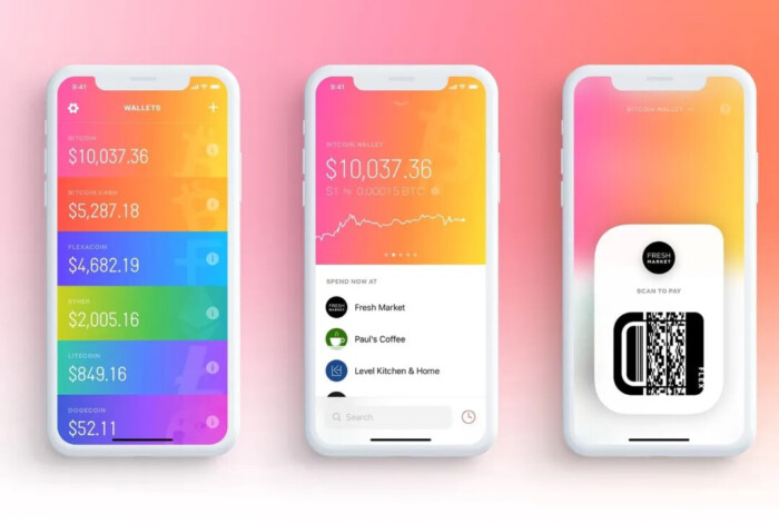
What do statistics say? In 2023, mobile wallets accounted for roughly half of global e-commerce payment transactions, making the digital wallet by far the most popular online payment method worldwide. This is expected to increase with a CAGR of 14.9 percent between 2023 and 2027. Credit cards ranked second with a 22 percent market share in 2023, a figure projected to decline in the coming years.
Remember about local popular payment solutions if you sell internationally. Payment options like BLIK in Poland or MBWay in Portugal are essential for low abandonment cart rate. In other regions, due to geopolitical situation and local fintech trends, cryptocurrency might be essential to include to maintain high conversion rates.
What else should you enable in your checkout process?
- Auto-filling information.
- Option of using the billing address as the shipping address.
- Augmented reality for pre-filling card information: ASOS and various other eCommerce are using this feature.
- Full overview: Details of the transaction visible should be visible at every step so that the customer knows how much is already done and how much is left.
Location and added value: Omnichannel support that enhances user experience
Real-time tracking is a psychological trick that works wonders in ecommerce. The ability to track gives customers a sense of comfort in a world that moves fast – if something goes wrong, they know immediately.
Just look at how Uber, a leader in mobile commerce, does it. You’ve probably caught yourself watching that tiny driver icon on the map, even if you weren’t in a hurry at all.
"The Uber map is a psychological moonshot, because it does not reduce the waiting time for a taxi but simply makes waiting 90% less frustrating."
Rory Sutherland – Vice Chairman, Ogilvy UK
A map is not just a map. In quick commerce apps, where it’s a critical tool, optimization is absolutely essential. Looking at how Uber’s map evolved over the years, one trend is clear: simplicity wins. Details are reduced, hidden in drop-down menus, and distracting visual elements like colors or labels are minimized.
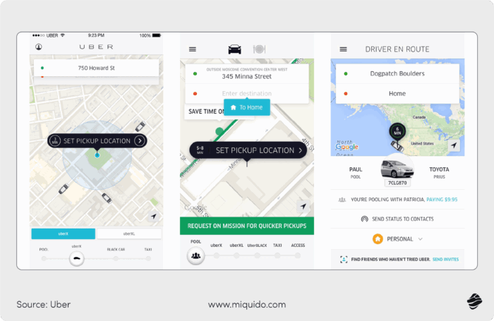
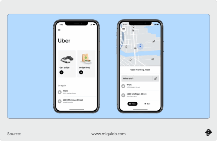
With more complex features like ride sharing, the UI of Uber's map view matters more than ever. The simplicity they went for enables users to focus on ensuring all the details of the shared trip match their expectations.
Uber's ridesharing feature adds complexity to the standard ride ordering process, which requires clever approach to UI.
In B2B and B2C ecommerce, maps are often more of a supporting feature. And since they rely on third-party providers, real-time tracking requires the right integrations to function properly. But investing in this feature pays off: in-app tracking becomes a unique value proposition, instead of redirecting customers to external logistics systems. Even a simplified map that shows the stage and location of an order adds a lot of credibility and trust.
If the map is a core feature of your app, the Quartix case shows why mobile app design really matters. Their map used to be cluttered – vehicle icons looked the same, critical details were buried, and the whole thing felt unreadable. Now, vehicles are instantly distinguishable, details appear at first glance, and the simplified layout separates drivers from vehicles in a single screen. Less tapping, faster access to information, and a stronger feeling of control.
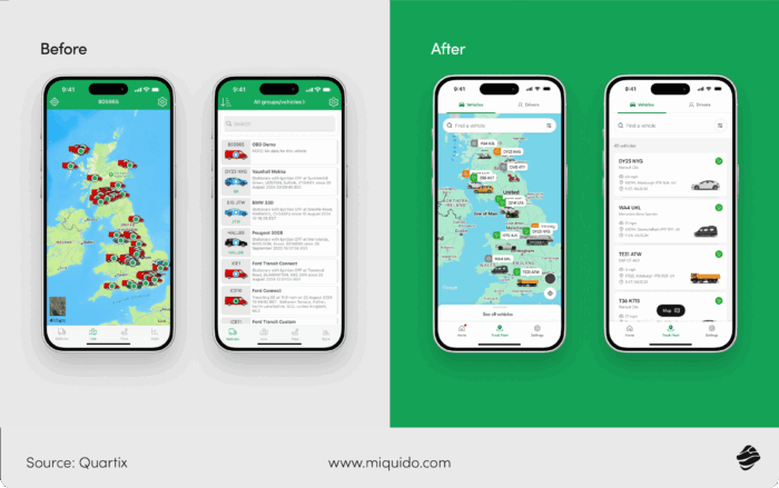
Though this example comes from logistics, these lessons are easy to transfer into quick commerce and ecommerce. Clean app UX design elements, smart interactive elements, and streamlined flows guide users through the process without frustration. Pair that with strong mobile app ux practices – clear maps, minimal clutter, and consistency across screens – and you have a tool that feels natural to use.
Ultimately, great mobile ux is about designing features that make sense, anticipate user behavior, and reduce friction every time a user performs an action. In this sense, real-time tracking is more than utility – it’s part of an overall mobile user experience strategy. And when done right, it’s a subtle but powerful way to guide users and elevate your mobile app design above the competition.
Physical store selector: A seamless omnichannel experience
For customers who value in-store pickup, checking product availability, or simply want to find the nearest location, the app must offer a seamless transition from the digital to the physical world.
Introducing a physical store selector is critical. The user should be able to choose a location via geolocation on an interactive map (utilizing psychological comfort similar to tracking a delivery) or from a precise, filterable list. This feature not only makes life easier but also supports logistics by accurately communicating inventory levels. For the mobile user, this means certainty and reduced anxiety about product availability, which is a strong factor in building trust.
Customer dashboard that gives added value: best UX practices
In mobile commerce application development, the customer dashboard is merely an addition, not a core feature...but what a powerful one. When properly utilized, it can drive conversion rates and customer value, motivating purchases and delivering additional value.
A well-constructed dashboard serves as a less intrusive alternative to push notifications. It doesn't hassle the user, but when they already have purchase intent and enter the app, it helps them easily find what they need and get inspired.
This is where Generative AI comes into action. Based on in-app data showing customer habits, interests, and barriers, it can generate product recommendations, important content, summaries...ideally with personalized commentary that builds relationships with the company.
Unlike several apps that compete for attention with generic experiences, a smart dashboard focuses on offering users exactly what they're looking for at the right moment. By understanding user needs through behavioral patterns, it can present horizontally oriented product carousels or vertically stacked recommendations that feel natural rather than pushy. This personalized approach sets it apart from any different app experience users might encounter elsewhere.
In B2B mobile commerce, such a customer dashboard can be an excellent way to strengthen client relationships by providing valuable insights. Clients should be able to see how much they've spent, on what, what they ordered in the same period last month, their procurement trends analysis, and upcoming contract renewals or budget allocations.
In both cases, clear diagrams or summaries showing in visual and numerical form how close the customer is to achieving the next level in the loyalty program are important dashboard elements. They introduce subtle gamification elements, becoming powerful motivating factors that encourage continued engagement and higher spending.
In mobile commerce, gathering and acting on user feedback plays a critical role in refining both the shopping experience and the conversion funnel. However, m-commerce users are typically focused on a clear goal — buying products quickly and conveniently. This makes it more challenging to capture direct feedback about the app itself: users are far more likely to leave comments about the product than the user interface, checkout flow, or performance.
To overcome this, feedback should be collected in micro-interactions, seamlessly woven into the shopping journey. Instead of interrupting users with lengthy forms, developers can integrate lightweight, contextual feedback prompts that appear naturally during key actions — for instance, after searching, viewing, or completing a purchase.
Practical approaches for collecting feedback in m-commerce
1. In-app micro surveys integrated into the shopping flow
Short, targeted prompts (1–2 questions) can appear:
- After checkout: “How easy was it to complete your purchase today?”
- After browsing: “Did you find what you were looking for?”
- After product delivery: “How satisfied are you with the delivery experience?”
Tools like Apptentive, Usabilla, or Hotjar for mobile allow for this kind of subtle integration. Keeping these interactions short and contextual increases participation while reducing friction.
2. Behavior-driven feedback triggers
Instead of asking for feedback randomly, use analytics to trigger feedback requests based on user behavior. For example:
- If a user abandons a cart twice, prompt: “Can you tell us what stopped you from checking out?”
- If a user spends long periods on a product page: “Was there enough information to make a decision?”
This makes the feedback relevant and actionable, while respecting the user’s intent.
3. Leveraging app store reviews and ratings strategically
App store feedback still matters, but m-commerce teams should treat it as a public reputation channel rather than the main source of design insights. Monitoring tools like AppFollow or Appbot help track sentiment trends and identify recurring issues. When responding, focus on clarifying the app experience (e.g., slow checkout or payment issues) instead of product complaints — demonstrating that the team is proactive and user-focused.
4. In-app analytics and implicit feedback
Since many users won’t explicitly tell you what’s wrong, use implicit feedback from analytics to infer pain points. High drop-off rates on checkout screens or product filters can signal usability issues more reliably than direct survey responses. Pairing these insights with small qualitative prompts (“Was this page helpful?”) creates a balanced feedback loop.
5. Lightweight post-purchase interviews or follow-up messages
After users have completed their transaction, they’re more open to share feedback — especially if it’s brief and incentivized. A follow-up push notification or email saying “Help us make shopping smoother” with a one-minute survey can provide valuable insights about usability or satisfaction.
The iterative cycle
The goal in m-commerce isn’t to collect more feedback, but to collect the right feedback at the right time — directly tied to the buying experience. By integrating micro-feedback loops throughout the customer journey, developers can iterate faster, refine key flows (like search, checkout, and payment), and enhance the overall experience without disrupting the user’s main motivation: to shop easily and confidently.
Loyalty programs: UX tips for building ecosystems that drive retention
In 2025, loyalty programs are crucial for long-term retention, evolving from simple points systems into sophisticated digital ecosystems that drastically enhance the mobile user experience.
Outstanding UX and seamless integration
Modern loyalty UX must be effortless and fast. With most users accessing programs on mobile, key UX principles ensure success:
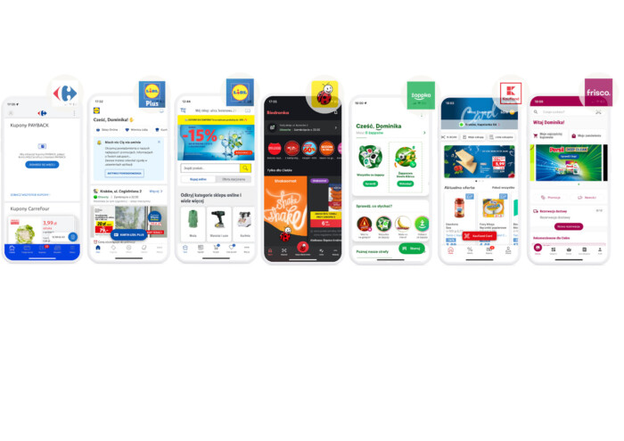
- Frictionless usability: Registration, coupon redemption, and card scanning must be instant, often integrated directly with mobile payments to create a single, seamless interaction. Features like Scan&Go kill the queue, embedding the loyalty function into a zero-friction checkout flow.
- Intuitive design: Apps avoid clutter by adhering to familiar mobile navigation patterns and using highly personalized, subtle communication instead of generic, annoying push notifications.
Value beyond discounts: AI and gamification
Loyalty thrives by offering continuous, personalized value:
- AI-powered personalization: Programs use AI and data analytics to deliver hyper-personalized offers and services tailored to specific shopping habits, making the app feel like a true digital assistant.
- Gamification: This transforms routine purchases into a rewarding game. Mechanics like virtual scratch cards or "shake" features introduce a dopamine loop that drives engagement and encourages repeat visits far more effectively than basic discounts alone.
- Superapp strategy: Leading programs are becoming mini-universes or "superapps," consolidating multiple services (e.g., parcel tracking, finance, recipes) into one platform. This builds strong brand dependence by meeting diverse customer needs in a single ecosystem.
Impeccable performance - a cherry on the top
Just as the onboarding, the performance is another dealbreaker for mobile commerce users. Even if you check all the boxes with the previous elements and polish your mobile app UX design, the lags and bugs can bury your chance for retention.
Mobile users are “digital hypersensitives”—they feel everything more intensely. If the app's speed is satisfactory (less than 2 seconds), users will remember it loading 15% longer than it did in reality. And when its loading time exceeds 2 seconds, the perceived delay feels 35% longer.
48% of users uninstall an app due to slow performance, and 32% look for a replacement—meaning you likely won’t win them back.. As you can see, the consequences of poor performance are quite severe. Better safe than sorry—here’s what you can do to improve your app’s performance and prevent user churn:
Speed up your store
- Use fast, modern image formats (like WebP) and compress files to load product pages instantly.
- Enable lazy loading so images and content appear only when needed.
- Combine multiple API calls into one request to reduce server load and cut response times.
- Enable caching and compression (HTTP/2, gzip) to make repeat visits lightning fast.
Streamline data handling
- Store frequently accessed data locally to keep browsing smooth, even offline.
- Sync only changed data instead of reloading full datasets — faster updates, less bandwidth.
Optimize the shopping experience
- Simplify layouts and limit unnecessary visual layers for faster, smoother page rendering.
- Use hardware acceleration to deliver fluid animations and transitions that keep customers engaged.
- Avoid redrawing the same screen elements — every frame should count toward a seamless UX.
Boost app & site performance
- Regularly profile your code to fix performance bottlenecks slowing down checkout or search.
- Run heavy tasks in the background to keep browsing, cart updates, and checkout responsive.
Keep your app energy efficient
- Limit background services and GPS usage to prevent battery drain and app uninstalls.
- Follow energy-efficient coding practices to deliver a faster, greener shopping experience.
Stay proactive with testing & feedback
- Monitor real user feedback and crash reports to continuously refine site speed and reliability.
- Run regular performance tests to catch issues before customers do.
Win customers in 2015 with the right mobile UI and UX design
In 2025, winning in mobile commerce is no longer about having the most features, but about providing the most frictionless experience. From the first-second impression of onboarding to the final tap on the payment screen, every micro-interaction defines whether you earn a loyal customer or a first-day uninstall. Prioritizing performance, accessibility, and intuitive design isn't just a best practice—it's the core driver of retention and sales.
Your app has only seconds to prove its worth. If you're facing high drop-off rates or low conversions, let's discuss how our expert UX/UI team can transform your mobile experience.
Why is mobile app UI design so important for e-commerce sales?
A poor mobile app UI design is a primary source of user friction. The article notes that 70% of app abandonment stems from poor usability, not a lack of features. A confusing layout, cluttered mobile user interface, or inconsistent design leads to frustration and quick uninstalls—often within the first 24 hours.
What are the key mobile UX design principles for better onboarding?
The most crucial mobile UX design principles for onboarding are speed and immediate value. Users must quickly reach their "Aha!" moment.
Ask only for essential information.
Keep the process short (ideally 4 steps or less).
Show a progress bar so users know where they are.
Instantly showcase the app's core value rather than forcing a long tutorial.
Key mobile app UX best practices involve creating clarity and reducing effort.
Establish a strong visual hierarchy that guides users to primary actions (e.g., "Add to Cart").
Reduce complexity by keeping the menu hierarchy flat and grouping related items.
Use familiar patterns, like a well-placed hamburger menu, for secondary options.
Ensure all tap targets are large (Apple recommends 44pt, Google 48dp) to prevent mis-taps.
How does accessibility improve the UX design for mobile apps?
Effective UX design for mobile apps must be inclusive. As the article highlights, designing for accessibility (e.g., high color contrast, simple layouts, reduced motion options, and screen reader support) doesn't just help users with disabilities; it improves the experience for all users by reducing cognitive load and making the app easier to use in various environments.
My checkout has a high drop-off rate. What mobile UX best practices can help?
Checkout is the most vulnerable step. Top mobile UX best practices to reduce friction include:
Offering a wide variety of payments, especially mobile wallets (the most popular method) and local solutions (like BLIK or MBWay).
Minimizing redirects to external banking sites that can break the flow.
Allowing guest checkout and securely storing billing details for repeat users.
Providing clear, real-time feedback and keeping the mobile user interface clean.
What's the difference between mobile app UI and UX design?
Mobile app UI design (User Interface) refers to the visual elements the user interacts with—the buttons, colors, typography, and layout. UX design for mobile (User Experience) is the overall feeling and flow of that interaction, covering everything from the logic of the onboarding process to the ease of navigation and the frictionless feel of the checkout.
How does responsive design relate to mobile app development?
While responsive design traditionally refers to websites adapting to different screen sizes, its principles are core to mobile app development. An app is inherently mobile-first, but developers and designers must still account for a wide range of device sizes, aspect ratios, one-handed use, and environmental factors like outdoor visibility to ensure a consistent, high-quality experience.
Beyond checkout, how can UX design for mobile apps build trust and retention?
Great UX design for mobile apps builds loyalty after the purchase. The article points to features like real-time order tracking (which provides psychological comfort) and personalized customer dashboards. These dashboards can use data to show loyalty status, provide valuable B2B insights, or offer AI-driven recommendations, all of which add value and keep users engaged.
Why is performance one of the most critical mobile UX design principles?
Because poor performance is poor UX. According to mobile UX design principles, a laggy app creates intense friction, with the article noting 48% of users will uninstall an app simply for being too slow. Optimizing images, caching data, and running heavy tasks in the background are just as crucial to the user experience as the visual design itself.


![[header] mobile app ui design tips for multiplying sales optimize your mobile commerce app](https://www.miquido.com/wp-content/uploads/2025/09/header-mobile-app-ui-design-tips-for-multiplying-sales_-optimize-your-mobile-commerce-app.jpg)



![[header] top 5 use cases for autonomous delivery in foodtech today](https://www.miquido.com/wp-content/uploads/2025/08/header-top-5-use-cases-for-autonomous-delivery-in-foodtech-today-432x288.jpg)
![[header]recognition in mobile apps challenges & solutions (1)](https://www.miquido.com/wp-content/uploads/2026/01/headerrecognition-in-mobile-apps_-challenges-solutions-1-432x288.jpg)
![[header] gamification in retail rewriting the shopping experience with gamified mobile apps (1)](https://www.miquido.com/wp-content/uploads/2026/01/header-gamification-in-retail-rewriting-the-shopping-experience-with-gamified-mobile-apps-1-432x288.jpg)