Without good user experience, success in the world of e-commerce is practically impossible today. There are countless stores, and when a product or service can be found in many places, it’s often the UX that determines conversion and retention.
If you don’t optimize user experience, you’re out of the game. This rule especially applies to mobile apps, where every oversight is felt more acutely due to the limited interface and navigation specifics.
In our latest article, we analyze mobile commerce UX best practices. Using the latest statistics, we identify aspects that are becoming increasingly important to users and are crucial for the sales and margins of e-commerce stores. Everything aligns with the key principles of good mobile commerce UX design!
Whether you use UX design services or designing the app internally, our tips will help you make the most of it and access the full benefits of mobile commerce.
Introduction to Mobile Commerce UX Best Practices
Designing mobile apps is a delicate art. In the mobile commerce UX design world, less usually means more. Fewer steps to complete a purchase, fewer interface elements, and simplified menus make it easier for users to buy.
Minimalism is also increasingly valued in communication and notifications. As users become more aware of digital hygiene, one notification too many can be enough to switch to a competing app. The smartphone, which accompanies us almost constantly, offers a unique opportunity for mobile commerce but also poses a risk. Companies must be increasingly cautious.
On the other hand, there is growing emphasis on maximum personalization, which younger generations particularly like (and increasingly demand). Without increasing the scope of personalization and personalized functions, the chances of winning the mobile e-commerce race are slim. Communication, functionalities, and interface are areas where leading e-commerce sellers are increasingly focusing, recognizing their importance to users.

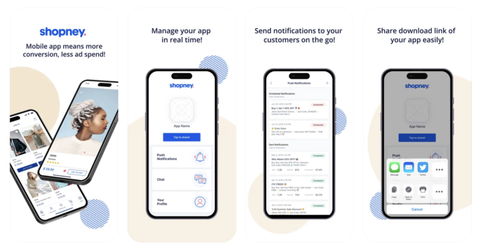
Mobile users are five times more likely to abandon a task if the website isn’t optimized for mobile. The key principles of mobile commerce UX design illustrated above apply to mobile users, but e-commerce companies must adopt a particular approach considering mobile devices’ specifics and limitations. These limitations also present opportunities for better conversion.
Streamlined Onboarding Process
Onboarding is often overlooked, but it determines whether an app will even have a chance to showcase its functionalities to the user. A poorly designed onboarding can ruin the chances of gaining a new user for good. A well-designed one increases retention by an average of 50%. To achieve this advantage, it’s worth implementing these mobile commerce ux best practices:
Request only the essential information
Nothing irritates users more than having to fill out numerous forms. It can also raise doubts about the legitimacy of your app. Who knows how you’ll use this data? Therefore, ask only for the information necessary for proper setup and personalization of the app—nothing more.
If you can skip a step, do it
The fewer steps to complete, the better. Mobile users have less time and are more distracted than desktop users. Combined with a shrinking attention span, this is an explosive mix—definitely unfavorable for your user acquisition rate. If you can easily combine a step with another, you probably don’t need to separate it. In this case, less is more.
Inform users about their onboarding progress
A simple progress bar or the number of remaining steps is enough. Not knowing what stage they are at can lead users to abandon the process. If they do, there’s a good chance they’ll never return.

Cut the way to “Aha” moments
Users should quickly realize the unique value of the app. Design onboarding steps to give rather than take immediately. In other words, instead of burdening users with data entry at the very beginning, show them right away why it’s worth their time. Use pop-ups and animations. Or, craft your message to kill two birds with one stone, as Puma does.

When balancing between mobile and desktop versions of the website, companies often fail to avoid basic issues (incorrect keyboard layout, tappable elements too close to each other or too small). A significant advantage of a mobile app is the ability to design navigation and the interface entirely for mobile users. What should you pay attention to when designing navigation and design? Here’s your detailed checklist.
Prioritize Actions
The golden rule: if you want users to perform a specific action, guide them to it. Once you define the primary actions in your app, make them easily accessible. Use prominent buttons, colors, fonts, animations, and UX writing to make these actions stand out. Place the buttons in strategic locations—between each few scrolls, in the middle of the interface.
Visual hierarchy is a powerful tool in guiding the user through the app toward a purchase. Use it to emphasize key actions and content. Larger buttons, bold text, and gradient shading—all these elements help the user understand where to look and what to click.
Reduce the Complexity
Use the spotlight pattern to highlight crucial elements of the interface and reduce visual overwhelm. But also reduce, reduce, and again, reduce. Keeping the interface tidy will help users focus on the crucial actions. To avoid clutter, you could hide less frequently used options in secondary menus.
However, remember to keep the hierarchy as flat as possible. One too many menu levels can negatively impact the user experience. Instead of dividing, try to group and reduce redundant menu elements.
Provide Visual Feedback
Through the appropriate use of highlights, transitions, and animations, you can help users navigate the app. Clearly indicate the active or selected state of navigation elements (e.g., highlighting the current tab) to help them understand where they are. Use subtle animations to transition smoothly between screens. All these aspects contribute to a better user experience.
Performance Optimization
Even the most intuitive navigation won’t do much if the app’s performance lags. Mobile users are “digital hypersensitives”—they feel everything more intensely. If the app’s speed is satisfactory (less than 2 seconds), users will remember it loading 15% longer than it did in reality. And when its loading time exceeds 2 seconds, the perceived delay feels 35% longer.
48% of users uninstall an app due to slow performance, and 32% look for a replacement—meaning you likely won’t win them back.. As you can see, the consequences of poor performance are quite severe. Better safe than sorry—here’s what you can do to improve your app’s performance and prevent user churn:
Optimize resource loading
- Efficient Image Handling: Use appropriate image formats (e.g., WebP) and compress images without sacrificing quality.
- Lazy Loading: Load images and content only when needed, such as when they come into view.
Make data management more efficient
- Local Storage: Store frequently accessed data locally using SQLite, Realm, or other local databases.
- Data Synchronization: Synchronize data efficiently by updating only changed data instead of full datasets.
Minimize network requests
- Batch Requests: Combine multiple API requests into a single request where possible.
- Caching: Implement effective caching strategies to reduce unnecessary network calls.
- Compression: Use HTTP/2 and gzip compression to reduce the size of network payloads.
Optimize UI rendering
- Avoid Overdraw: Ensure that the same pixel is not drawn multiple times in a single frame.
- Optimize Layouts: Use constraint-based layouts and avoid deep view hierarchies.
- Hardware Acceleration: Leverage hardware acceleration for smoother animations and transitions.
Optimize code performance
- Profiling and Benchmarking: Use profiling tools to identify and optimize slow code paths.
- Multithreading: Offload intensive tasks to background threads to keep the main thread responsive.
Make background processing more efficient
- Background Tasks: Use background processing judiciously to avoid draining battery and affecting performance.
- Job Scheduling: Use job schedulers to manage background tasks efficiently.
Monitor and optimize battery usage
- Reduce Battery Drain: Minimize the use of background services and optimize the usage of GPS and other battery-intensive features.
- Energy-Efficient Coding: Follow best practices for energy-efficient coding to enhance battery life.
Test regularly
- Performance Testing: Conduct regular performance testing to identify bottlenecks and areas for improvement.
- User Feedback: Monitor user feedback and crash reports to identify and fix performance issues.
Personalization and Customization
Mobile apps offer robust analytics capabilities—take advantage of it! By analyzing data such as the time of day users are active, specific days of engagement, and weekend usage patterns, you can tailor experiences to individual preferences and seize unique sales opportunities, which are crucial for mCommerce. Here are some examples of effective customization features with their exemplary real-life implementations:
- Customizable interfaces: Drag and drop elements, remove and add items to the dashboard, and change background colors. Examples: ClickUp, Wish, Poshmark (custom wish lists).
- Curated content: Personalized lists, feeds, playlists, and recommendations.
- In-App communities & features: Compare results and compete with others. In-app messaging and community updates. Examples: Depop, Etsy (shop updates, forums, and teams).
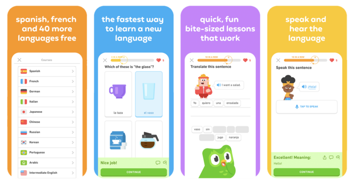
- Real-time personalized push notifications & widgets: Location-based offers and notifications (Uber Eats), engaging notifications and the quirky “Unhinged owl” widget (Duolingo), real-time discount offers, and geo-fencing alerts, like pop-up store notifications (SNKRS, Nike app).
Keep in mind: if you want extensive personalization options, go for native mobile apps over PWAs. Native apps offer deeper device integration, enabling advanced personalization features like augmented reality and voice recognition. They also allow for real-time push notifications based on geolocation, providing personalized recommendations and geo-fenced offers that are not possible with browser-dependent PWAs. This approach ensures a more immersive and tailored user experience.
Seamless Checkout Process
Apart from onboarding, the checkout process is another crucial and vulnerable point on the purchase path. Even if the user journey has been smooth up to this point, don’t rest on your laurels—users won’t hesitate to abandon their cart if they encounter an obstacle. The major one is the lack of preferred payment options, which is the second most common reason e-shoppers did not complete their e-commerce purchases (40 percent).
Despite being a key element of the user journey in the e-commerce industry, the checkout process remains one of the most neglected. In a 2021 report on European checkout trends, 42% of top businesses had three or more checkout errors related to inputting card information or displaying payment errors, 61% didn’t allow customers to auto-fill information, and 10% didn’t support the popular “use billing address as shipping address” function.
How can you encourage customers to complete their purchase at this stage? Here are some mobile commerce UX best practices for the checkout process that could reduce cart abandonment rates at the checkout stage:
Minimization of steps
Think about including the one-click checkout. Amazon introduced this concept and holds the patent for it, but today it is used by various eCommerce giants like Shopify and companies from financial sector like PayPal or Stripe. This feature allows users to make purchases with a single click, using saved payment and shipping information.

Diversification of payment options
Observe your users’ choices and the competition’s choices to create the most inclusive payment option span. What do statistics say? In 2023, mobile wallets accounted for roughly half of global e-commerce payment transactions, making the digital wallet by far the most popular online payment method worldwide. This is expected to increase with a CAGR of 14.9 percent between 2023 and 2027. Credit cards ranked second with a 22 percent market share in 2023, a figure projected to decline in the coming years.
Remember about local popular payment solutions if you sell internationally. Payment options like BLIK in Poland or MBWay in Portugal are essential for low abandonment cart rate.
What else should you enable in your checkout process?
- Auto-filling information.
- Option of using the billing address as the shipping address.
- Augmented reality for pre-filling card information: ASOS and various other eCommerce are using this feature.
- Full overview: Details of the transaction visible should be visible at every step so that the customer knows how much is already done and how much is left.
User Feedback and Iterative Design
Gathering and processing user feedback effectively is essential for improving apps and enhancing user satisfaction. In-app surveys are a direct way to capture user opinions, allowing for immediate feedback on specific interactions. Tools like SurveyMonkey, Google Forms, and Typeform make it easy to integrate these surveys. Keeping them brief and relevant ensures users are more likely to participate, providing valuable insights without being intrusive. This real-time data collection helps identify user sentiments and areas needing improvement.
App store reviews and ratings offer another valuable source of feedback. By monitoring platforms such as AppFollow, Appbot, and TheTool, developers can gather insights from user comments and ratings. Responding to these reviews is crucial, as it demonstrates that the company values and considers user feedback. Engaging with users in this public forum can also clarify misunderstandings and show potential users that the app has an active and responsive support team. Moreover, addressing issues raised in reviews can prevent negative sentiments from spreading.
User interviews provide deeper insights into user experiences and motivations. Conducting one-on-one sessions using tools like Zoom, Skype, or Google Meet can reveal nuanced feedback that quantitative data might miss. To make the most of these interviews, it’s essential to prepare open-ended questions that encourage detailed responses. This qualitative approach complements other feedback methods by providing context and depth to the issues users face. Through careful analysis of these conversations, developers can better understand user needs and refine the app accordingly.
Accessibility and Inclusivity
With the growing consciousness of inclusivity and accessibility in the digital sphere, more and more companies are adjusting their mobile apps to meet the needs of every user, regardless of their abilities.
Here are the subtle interface adjustments that can make a visually impaired user’s experience much easier:
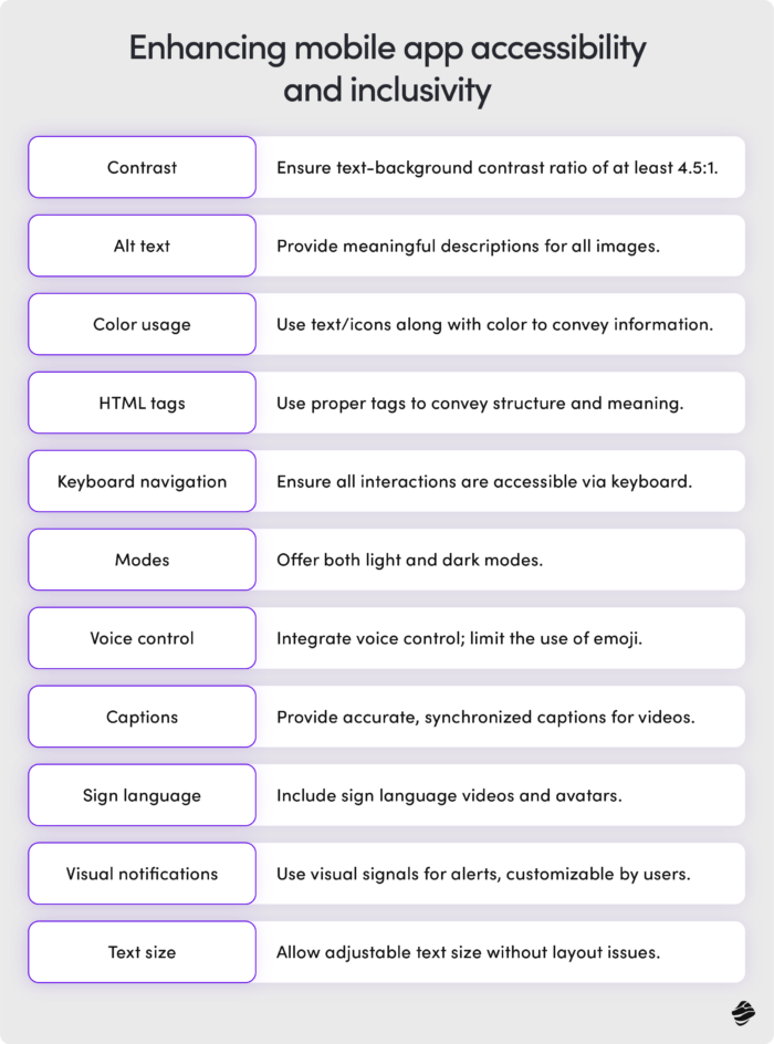
- Ensure sufficient contrast between text and background (minimum ratio of 4.5:1).
- Provide meaningful alt text for all images and decorative elements.
- Use text or icons in addition to color to convey information.
- Use proper HTML tags to convey structure and meaning.
- Allow users to adjust text size without breaking the layout.
- Make sure all interactive elements can be accessed using the keyboard (tab key).
- Provide light and dark modes to accommodate different visual needs.
Voice control integration is another crucial aspect for those with visual difficulties. Avoiding too many emojis will make their experience much smoother and more pleasant, as voice assistants read them as part of the content, which can affect overall comprehension.

Ensure your app is accessible to users with hearing difficulties by:
- Providing accurate, synchronized captions for all video content.
- Including sign language videos and avatars in your app.
- Using visual signals for notifications instead of or in addition to sound alerts.
- Allowing users to customize visual notification settings according to their preferences.
Mobile commerce UX: best practices. Put them into practice!
As Miquido, we can translate these best practices into your app’s success, providing you with comprehensive mobile commerce app development services and UX audit services. Through multiple experiences, our experts learned how to conduct UX audit that makes a difference. Let’s join forces and put that knowledge into practice!If you are looking for more practical insights for designing relevant mobile apps, check the mobile commerce statistics for 2024 on our blog. The mobile commerce is changing and it’s worth to stay on top of the news.


![[header] fintech challenges in 2025](https://www.miquido.com/wp-content/uploads/2025/07/header-fintech-challenges-in-2025-432x288.jpg)


![[header] how is ai used in fintech use cases & insights](https://www.miquido.com/wp-content/uploads/2025/06/header-how-is-ai-used-in-fintech_-use-cases-insights-432x288.jpg)


