Worldwide, there are around 285 million people with visual impairments. Thus, when designing a new application or considering a design revamp, it’s certainly a good idea to adjust your app to the needs of this broad group of users. Customising applications for visually impaired people enhances the experience of all your users. What are the other reasons to consider improving the accessibility of your app, and how to do it? Please find all the answers below!
How visually impaired people use apps?
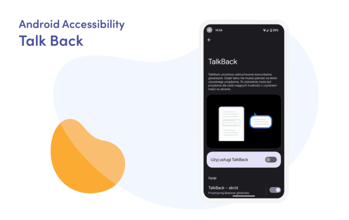
A screen reader is a tool for running applications (or simply browsing your smartphone screen) for blind and visually impaired people. The most popular screen reader for Android is TalkBack. With this tool, the user performs input via gestures such as swiping or dragging.
Usually, the output is spoken feedback. In TalkBack, we have two gesture input modes:
- Touch exploration, where you drag your finger across the screen.
- Linear navigation, where you swipe left and right with your finger until you find the item of interest.
Once you arrive at the item you’re interested in, you can double tap on it to activate it. Want to know more about how to run TalkBack? Please read the following article.
Accessible app principles
To enable people with visual impairments to use our application, we first need to understand the principles we must follow when designing it. Therefore, before we move on to the implementation section, let’s discuss the most important assumptions.
Layout and typography
The visual part of the app is critical. Properly implemented buttons and text handling are one of the most important factors that make the application accessible.
Touch targets
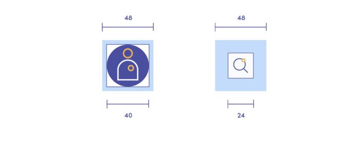
Touch targets are parts of the screen that respond to user interaction. The main recommendation is to create touch targets with a resolution of at least 48dp x 48dp. You will read more about this in the next chapter.
Colour and Contrast
The World Wide Web created colour contrast accessibility guidelines to help and assist users with colour deficiencies. According to the documentation, the critical aspects regarding the colour contrast accessibility are:
- Ratio: text and interactive elements should have a colour contrast ratio of at least 4.5:1.
- Colour as an indicator: colour should not be the only indicator for interactive elements. It would be best if you also underlined links on hover or marked required fields with an asterisk.
- Colour blindness: red/green colour blindness is the most common. Hence, you should avoid green on red or red on green. For the same reason, please avoid using red and green for “bad” and “good” indicators.
Typography
Users can increase the font size to improve readability. In Android devices, it’s a frequently used system option, so ensure there is enough space for large and foreign fonts.
Accessibility text
Accessibility text is both visible text (e.g., UI element labels, text on buttons, links and forms) and invisible descriptions (content descriptions, which can provide more information about the described component).
What are the most common use cases of accessibility text?
Control types and states
Screen readers, such as TalkBack, can automatically announce a control’s type or state by either speaking the control name or making a sound.
Indicating elements by the action
Action verbs indicate what an item or link does when you tap on it and describe what a view does.
Elements with state changes
In the case of icons that toggle between values or states, the screen reader describes an icon according to how it is presented to the user. For more examples, please read the Material Design guideline.
Summary
This chapter taught you how design should be adapted for visually impaired and blind people. So far, we’ve covered layout, typography and text accessibility. Now we will move on to the principles of their implementation.
Accessibility implementation
In the following section, I will focus on the key aspects of implementing accessibility to your app. Let’s find out how to do it right when developing on Android!
Layout – Touch target
As I mentioned in the theoretical part, every clickable element should have at least 48dp/48dp.
There are several options to do this. You could:
- Determine the values for the width and height attributes as recommended (48dp/48dp)
- Add padding around the icons
- Specify values for the attributes: MinWidth and/or minHeight
- Register TouchDelegate.
Look at an example from Google’s official documentation. It shows the element that has the recommended size of the touch target:
<ImageButton
   ...
   android:minWidth="40dp"
   android:minHeight="32dp"
   android:paddingLeft="4dp"

   android:paddingTop="8dp"
   android:paddingRight="4dp"
   android:paddingBottom="8dp" />
Accessibility text
One of the ways to attach the accessibility text to your UI elements is to use an Android attribute called ContentDescription. If you don’t provide it for an image button, for example, the experience for a TalkBack user can be jarring.
Look at the example:
<!-- The value for the following string is "Search". -->
<ImageView
   ...
   android:contentDescription="@string/search" />
For decorative elements such as spacers and dividers, set its “android:contentDescription” attribute to "null". If your app supports only the devices that run Android 4.1 (API level 16) or higher, you can instead set “android:importantForAccessibility” attributes to "no".
Please, ensure not to include control type or control state in your content description. Android natively has words like buttons, selected, checked, etc.
Labelling techniques
Below you can find a set of good practices for describing UI components in your application.
Components that describe each other
If you have a component that allows you to provide some data (e.g. EditText), it is good to have a View object that describes it (e.g. TextView). This is why the attribute "android:labelFor" was created. Please take a look at the example:
<!-- Label text would be "Name:" -->
<TextView
   ...
   android:id="@+id/nameLabel"
   android:labelFor="@+id/nameEntry"
   android:text="@string/name" />

<!-- Accessibility text will be "Edit text for name" -->
<EditText
   ...
   android:id="@+id/nameEntry" />

<!-- Label text would be "Surname:" -->
<TextView
   ...
   android:id="@+id/surnameLabel"
   android:labelFor="@+id/surnameEntry"
   android:text="@string/surname" />

<!-- Accessibility text will be "Edit text for surname" -->
<EditText
   ...
   android:id="@+id/surnameEntry" />
Related elements collection
If your app has UI elements that are naturally related (such as fields with information about a book), you can arrange them into groups by using a focusable container. To do so, set the container object “android:focusable” attribute to true.
In doing so, TalkBack can present the inner elements’ content descriptions, one after the other, in a single announcement. Grouping content reduces the amount of swiping the user has to do while streamlining speech output. Please look at the example:
<LinearLayout
   ...
   android:id="@+id/book_data_container"
   android:orientation="vertical"
   android:focusable="true">

   <TextView
	  ...
       android:id="@+id/book_title"
       android:text="@string/title"/>

   <TextView
	  ...
       android:id="@+id/book_author"
       android:text="@string/author"/>

   <TextView
	  ...
       android:id="@+id/book_pages"
       android:text="@string/pages"/>
</LinearLayout>
Of course, if your container has nested views, you can also apply this solution to them. This will make navigating your application even more accessible.
Accessibility actions
When your app supports actions such as a click, long press or swipe, you need to adjust these actions to people with visual impairment. That is what we will focus on in this part of the article.
Look at how you can implement it:
ViewCompat.addAccessibilityAction(
   // View to add accessibility action
   itemView,
   // The label that the accessibility service reads
   getString(R.string.save)
) { _, _ ->
   // Accessibility command
   saveItem()
   true
}
This results in TalkBack announcing “Double tap to archive”.
With the accessibility action implemented, users can now access the action through the actions menu. I’ll tell you a little later about navigating to this menu. Please, remember: it is essential to allow users to perform all flows within your app efficiently.
Widgets
This section is short but very important. When you create your UI component, use or extend system-provided widgets that are as far down Android’s class hierarchy as possible. System-provided widgets far down the hierarchy already have most of the accessibility capabilities that your app needs. The main ones include:
- Accessibility actions
- Characteristics
- State information.
Thanks to this, you won’t need to write full accessibility support for a component from scratch, and you will reduce the risk of error.
TalkBack continues to grow. We used two Context menus (global and local) not so long ago to navigate our smartphone system. Now, these two menus have become one.
The context menu is used for two primary purposes:
- As the name suggests, it is used for navigation. You can navigate through words, headers, links, rows, unique content, or other points depending on application preferences or capabilities.
- The second purpose allows the user to change TalkBack settings and controls quickly.
In this menu, you can find a set of actions (mentioned in the “Accessibility action” section above). How can you access this menu? It’s very simple. You just have to make a swipe up and right gesture.
Accessibility testing
In the projects I have developed so far, I mainly benefited from the three following aids: Accessibility scanner, Espresso and Lint. Of course, you have much more tools at your disposal. I highly recommend you check them out by yourself. You can find all the necessary documentation here.
Accessibility Scanner
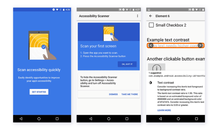
This tool scans the user interface and provides recommendations for improving application accessibility.
Accessibility Scanner allows anyone, not just developers, to quickly and easily identify some common accessibility enhancements, e.g. small touch targets, contrast errors for text and images, missing content descriptions for unlabelled widgets, etc. If you want to start using Accessibility Scanner or simply search for more detailed instructions, please read the following documentation.
Android Lint
I’m sure that most of you know this tool from your daily work. What is worth remembering is that Android Studio also provides warnings about various accessibility issues and links to places in the source code that contain these issues.
Espresso
Espresso is an Android test library that allows you to quickly and easily test your user interface. It enables interaction with the application’s tested user interface components and ensures that certain behaviours occur or conditions are met. Of course, as part of the accessibility support, you can enable and configure accessibility testing.
Summary
Making Android device accessible doesn’t just open it to new users. It helps to improve our daily life and makes the world more inclusive. I hope that this article has helped you to learn about accessibility. For further reading, please don’t forget to check the official documentation.
Want to learn more about WCAG and accessibility in mobile apps? Read our comprehensive guide!


