Do you have a great idea for your mobile app? That’s perfect! But even the most innovative idea won’t guarantee success if you don't put your target end-users and their needs at the centre of all your efforts.
So, how can you make sure mobile app users will keep returning to your app instead of rushing toward your competitors? A flawless user experience is the answer!
This comprehensive guide will tell you everything you need to know about mobile UX design. We'll walk through best design practices and identify the business benefits of providing a seamless experience for mobile users.
But first…
What is mobile user experience (UX) design?
Simply put, mobile UX (User Experience) design is the process of creating a seamless and meaningful experience for people using a mobile device or a wearable. With this approach in mind, designers strive to meet users' needs, requirements and expectations toward mobile digital solutions, mostly applications. Here, the main focus is to make mobile apps or websites displayed on phones as accessible, valuable and usable as possible.
Importantly, you need to keep in mind that UX design differs slightly from mobile UI design, and these terms can’t be used interchangeably. While UI design concentrates solely on the surface of the mobile product, UX design goes far beyond just visual presentation. For that reason, the UX design process includes steps like user testing, market and competitive analysis, as well as user research (including the analysis of user behaviour).
What’s the business value of UX design for mobile apps?
Currently, there are 1.96 million apps available at your fingertips in the Apple App Store and 2.87 million apps in the Google App Store. These numbers speak for themselves and prove that it’s extremely challenging to stand out from the crowd and outperform the competition.
In such a highly competitive environment, users have a wide selection of mobile apps to choose from. And as you can easily guess, they will opt for the best ones. It leads to one conclusion: only by providing a valuable and seamless user experience can you convert users into fans of your app.
Mobile user experience design may bring some satisfying business benefits, such as:
- A large number of app downloads
- Positive user app ratings and reviews
- Considerably higher mobile app retention rate
- More in-app conversions
- High revenue
- Investing money in only the most necessary app features
- Gaining extensive knowledge about your target audience
As you can see, good mobile UX design is not there just for its own sake but can help you elevate your business to a whole new level.
What are the differences between desktop and mobile UX design?
Does it even matter if you're building your digital solution for a desktop or a mobile phone? It definitely does!
Just think about it: do you use desktop and mobile apps in exactly the same way? Or maybe they differ somehow in terms of content organisation or menu presentation? I’m sure you’ve noticed that the differences are quite substantial.
The main differences between desktop and mobile app UX design come down to:
Screen size
As desktops have much larger screens than mobile devices, they can include comparatively more extensive sections, and they will still look pretty good and legible. With mobile UX, things are a bit more complicated.
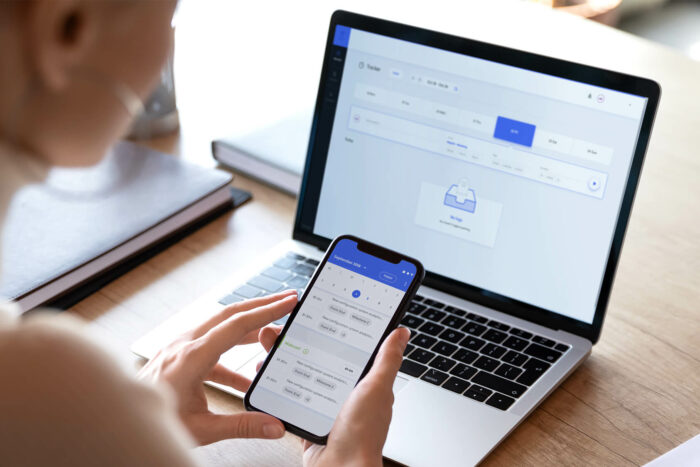
When designing an application or a website tailored to a mobile device, you need to include only the most essential information. Make a proper selection and consider which sections are necessary and which ones can be omitted. After all, you have only 4 or 5 inches at your disposal, so make good use of them.
Content organisation
Different screen sizes affect the way content is organised. Since desktops are much larger and have more screen space, they give designers more flexibility in building layouts. Here, designers can place content in multiple columns, and the user still won't experience any significant difficulties finding all the necessary information.
On the other hand, mobile design requires long scrolling if we want to include several long sections. So you don't have to squeeze everything above the fold. That would cause an unnatural visual effect and makes the content illegible.
So don’t be afraid to use long scrolling in your mobile digital solution. It turns out that users are willing to start scrolling if the content page encourages them to do so. According to MOVR, half of users start scrolling within 10 seconds, and 90% within 14 seconds.
Menu
Another design distinction between desktop UX design and mobile UX design is menu formatting. You can freely place an extensive menu on desktops with numerous categories or even subcategories. Just like we did on our website:
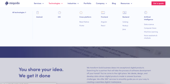
Users who reach the website from desktop devices can easily read the text from all the categories and click the links without hassle.
However, creating a layout for mobile sites is an entirely different story. Here, users don’t select a category in the menu using the cursor but by tapping with their fingers. And since our thumbs are relatively larger, menus on mobile devices need to have much more space. For that reason, single-level menus are a much more prevalent solution in mobile UX design.

5 best practices in mobile UX design
You’ve learned what great mobile UX design is, why it’s so important from a business perspective, and we’ve also talked about how different devices require different design approaches.
Now it’s time to put the theory into practice and discover the best strategies to make excellent mobile app design. You’ll deliver an outstanding and hassle-free mobile app user experience to your users by following them.
1. Make it fully accessible
App accessibility is the practice of creating digital products in which no user experiences exclusion and can access the product practically at any time. Therefore, you must also include users with various permanent or temporary impairments when creating a mobile product.
Importantly, accessibility is no longer merely suggested for business owners but has become legally regulated. Official Web Content Accessibility Guidelines (WCAG) state that every web content must be perceivable, operable, understandable, and robust.
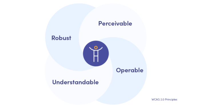
To make the mobile product as accessible as possible, you need to follow these rules:
- Make a clear distinction between foreground and background colours.
- Avoid introducing fast-changing colours and other visual effects that may cause seizures.
- Provide captions to videos and introduce text-to-speech functions or audio descriptions.
- Make the essential layout elements easily adjustable.
These are only examples of how to make a digital product more accessible. Visit the official website of WCAG for more detailed guidelines.
While the practices above form the foundation of any mobile product, the industry is moving toward a more proactive approach. To truly stand out in 2026, designers must look beyond reactive interfaces.
One rule always applies to navigation: there's no need to reinvent the wheel. Trying to use revolutionary and therefore unintuitive solutions can confuse and irritate the user. And that’s not your intention, right?
When designing your navigation, consider the following rules:
- Use common navigation patterns like the hamburger menu.
- Choose easily recognisable icons such as home for the home screen.
- Make sure all the sections are easy to reach.
- Make the navigation visible.
- Prioritise the options you place in the main menu.
With all that information in mind, try to simplify navigation as much as possible and use standard and well-known design patterns. That’s always the key to success!
3. Always put users at the centre
This rule applies to any type of design, not just mobile digital products. So, you should remember once and for all: when creating a mobile app or a website, you need to always concentrate on your users’ needs and expectations, and do whatever it takes to make their experience as pleasant and relevant as possible.
And how do you get to know your potential users better? How to discover what irritates them or causes problems? By conducting thorough user research.
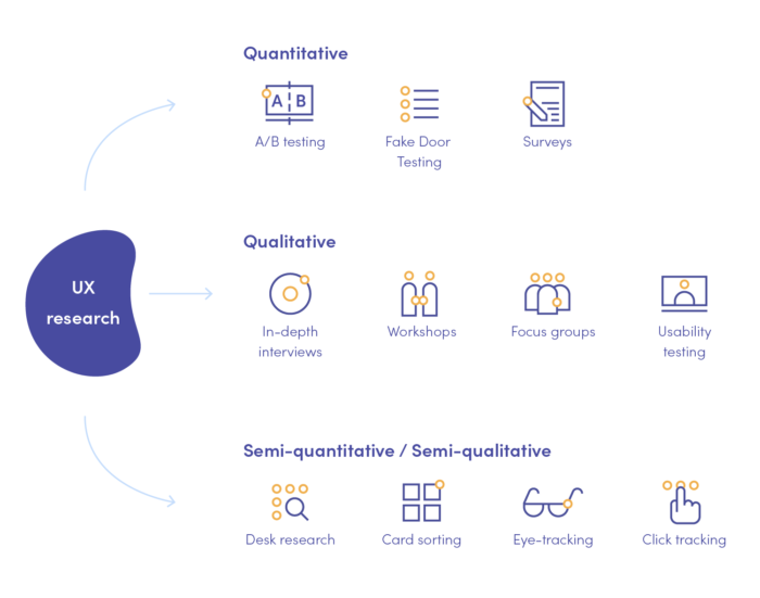
During this process, you will not only examine users but also analyse the market and competitors. By applying different qualitative and quantitative methods, you will be able to gather user feedback to use in the further steps of the design process.
Here are our favourite UX research methods that we recommend for gathering both qualitative and quantitative data:
4. Consider mobile design constraints
As we have already explained, designing for desktops and mobile devices differs in many ways. And one of the most impactful differences is that mobiles face far more limitations. They result from the considerably smaller screens, the possibility to display a single window at a time or even storage capacity.
This is why when creating a user-friendly mobile solution, you need to consider all the constraints that may disrupt a smooth experience.
5. Make the content legible
Want to engage your users and make sure they keep consuming your content? You need to make sure that your text is legible. Experience the power of UX writing for yourself.
When it comes to typography, follow these simple rules:
- Always choose fonts that will go well with different sizes and weights.
- Use adequate contrast between the text colour and the background colour.
- Avoid small text size - below 11 points, the text becomes practically illegible on a mobile screen and may cause eye strain.
The shift to anticipatory UX: Designing for intent, not just clicks
For years, mobile UX focused on reducing friction in a journey the user had already started. In 2026, the benchmark for great design is anticipatory UX. This is the ability of an app to predict a user's intent and eliminate steps before they happen.
From personalization to proactive logic
Standard personalization shows your name or suggests a product. Anticipatory logic changes the interface based on your context.
If an app detects you are moving fast via GPS, it should automatically surface quick actions. This also applies when you have a calendar event starting in five minutes. A summary view replaces a deep-navigation dashboard to save time.
The "correction" loop is another vital tool. When a user hesitates at a specific field for more than three seconds, the app should not wait for an error. It provides a simplified input method immediately.
Generative UI (GenUI)
We are moving away from fixed layouts. With Generative UI, the app rebuilds its own interface in real-time based on the user's current goal.
A first-time user sees a streamlined, wizard-based UI. The AI detects increased proficiency over time and unlocks advanced gestures. This keeps the experience efficient for power users without overwhelming novices.
Sustainable UX: the "lighter by default" mindset
In 2026, performance is UX. Sustainable UX (or green UX) is a technical necessity for speed and battery life rather than a niche branding choice.
Designing for OLED screens makes high-contrast dark modes an energy-saving infrastructure. These layouts reduce the physical wear on the user's device.
Great UX now means removing digital bloat. Autoplay videos and heavy JavaScript add no functional value. These elements increase cognitive load and energy consumption, so they must be eliminated to maintain high performance.
Ethical transparency as a design element
Users are becoming algorithmically skeptical because AI does more behind the scenes. Your UX must include explainable design to build trust.
Whenever an app makes a proactive suggestion, like rescheduling an appointment, a small indicator explains the logic. This note might cite your traffic data or a 9 AM meeting as the reason for the change.
The "undo" button is the most important element in an AI-driven app. If the app acts on behalf of the user, the manual override must be more prominent than the confirm button.
Improve UX for mobile devices with Miquido as a strategic partner
Offering users a "nice" or "good enough" interface will not win them over and meet their expectations. You need to make sure that their entire experience and every interaction with your mobile solution is flawless, hassle-free and relevant. Therefore, choosing the right user experience design agency is crucial to the development of your unique digital products.
Here, we have collected some good practices that may improve your mobile UX design. However, remember that this process is far more complex, and every digital solution needs a custom approach.
Want to build your mobile application or improve the existing one? Choose the best mobile app development company that will create stunning user-centred solutions.


